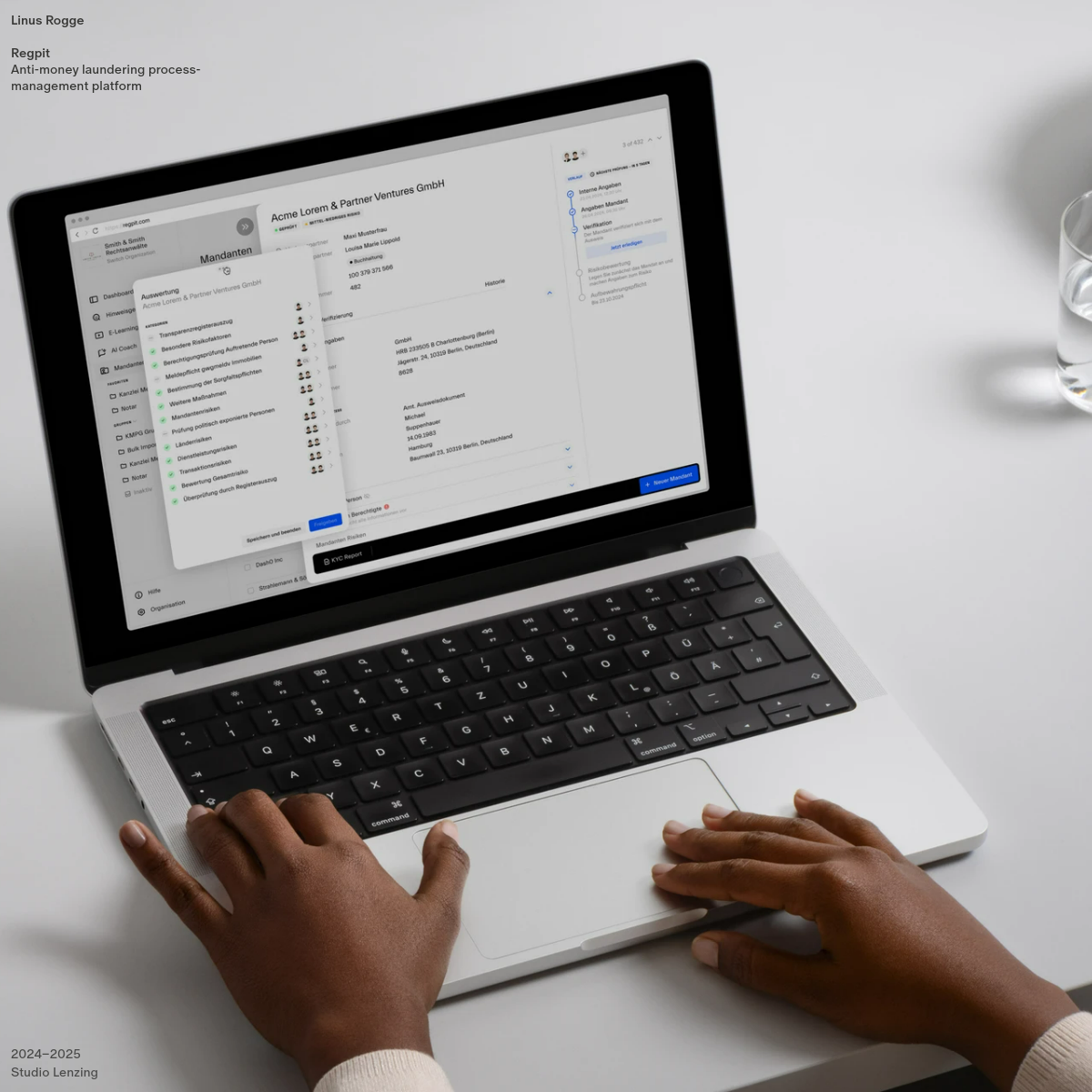
A regulatory compliance command center for financial professionals
02
Color
#0052FFAccent
#1A1A1AInk
#595959Ink soft
#FFFFFFBG
#F5F5F5BG soft
#FAFAFABG quiet
#999999Muted
rgba(0, 0, 0, 0.08)Line
High-contrast utility with a single strategic blue accent to denote primary actions.
03
Typography
geometric-sans · humanist-sans · monospace
display40px · 600
heading24px · 500
body14px · 400
caption12px · 400
Use tight leading for dense data tables to maximize space efficiency. · Prioritize legibility over stylistic flair in all text elements. · Maintain consistent weight hierarchy to distinguish primary from secondary information.
04
Spacing
4px
8px
12px
16px
24px
32px
48px
64px
Strict 4px grid to align complex data structures and dense layout components.
Fixed sidebar navigation with a fluid main content area divided into cards.
07
Motion & Interaction
120msmicro
200mssmall
350msmedium
cubic-bezier(0.25, 0.1, 0.25, 1)easing
Subtle fade-in for modals and dropdown menus. · Immediate state changes for checkboxes and toggles.
Subtle background color change on rows and list items to indicate interactivity. · Immediate visual feedback on buttons and interactive elements.
08
Components
buttonPrimary: solid blue (#0052FF) with white text. Secondary: ghost style with gray border.
cardWhite background, subtle gray border, very small border radius (4px) for a utilitarian feel.
chipSmall, rounded tags used for status indicators or filters, often with light background fills.
inputClean text inputs with clear labels above, using bottom or full borders.
heroNo traditional hero; the main view is an immediate, data-rich workspace or modal overlay.
09
Voice & Don'ts
ToneAuthoritative, precise, and professional. Focused on clarity and task completion.
HeadlinesDirect and functional. Avoids marketing fluff in favor of clear section titles.
CTAsAction-oriented verbs (e.g., 'Speichern und beenden', 'Neuer Mandant') on clear, distinct buttons.
Don't use vibrant, playful color palettes — the screenshot shows a highly restrained, mostly monochromatic UI.
Don't use decorative serif fonts — the interface relies entirely on clean sans-serif typography for legibility.
Don't use large, airy spacing — the design prioritizes information density to show complex data.
Don't use heavy drop shadows — shadows are very subtle and used only to gently lift cards or modals.
Don't use rounded, bubbly buttons — the components are sharp and rectangular for a utilitarian feel.
Don't obscure data with heavy overlays — even modals are clean and designed to present actionable information clearly.
Avoid: Playful or colloquial language.
Avoid: Vague, inspirational marketing copy.
Avoid: Excessive exclamation marks or emoji.
11
System prompt
Regpit is a B2B fintech platform for anti-money laundering process management. The design language is utilitarian, clean, and data-dense, prioritizing workflow efficiency over visual flair. Key hex colors are #FFFFFF (background), #1A1A1A (ink), and #0052FF (accent for primary actions). Typography categories are geometric-sans for display and humanist-sans for body text to ensure maximum legibility in dense interfaces. Critical design constraints: 1) Do not use vibrant or playful color palettes; the UI is strictly monochromatic with a single blue accent. 2) Do not use decorative serif typography; the system relies on clean sans-serif fonts for clarity. 3) Do not use large, airy spacing; the layout prioritizes information density to present complex compliance data efficiently.
Bring this taste to your agent
Hand your AI agent a machine-readable spec of this design — tokens, type, motion, the whole DNA.