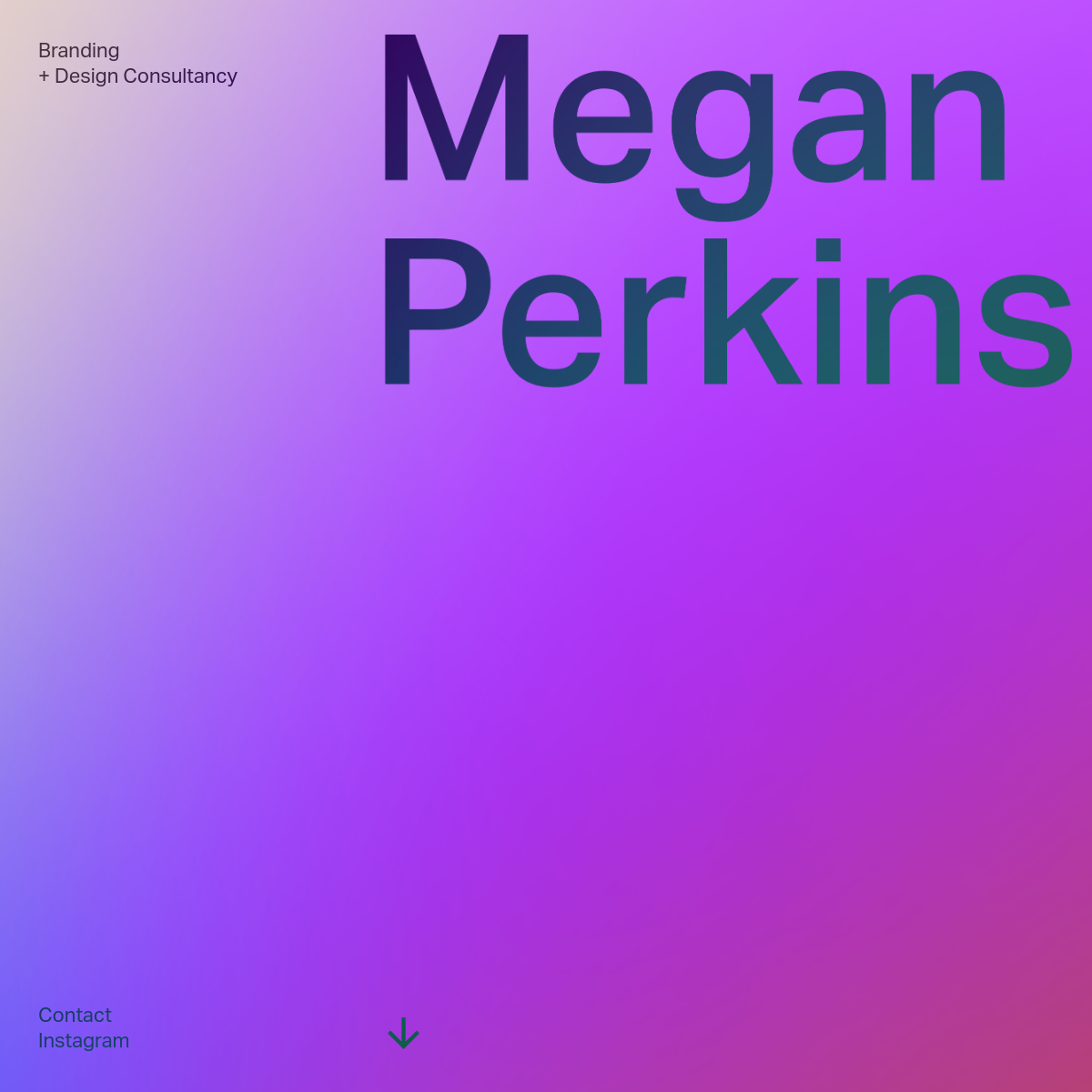
A vibrant, multi-color gradient serves as the primary background, creating a bold and expressive foundation for high-contrast dark typography.
03
Typography
geometric-sans
display160px · 500
body16px · 400
Main heading uses a large, geometric sans-serif with tight tracking. · Small text is set in a lighter weight of the same geometric sans-serif family.
04
Spacing
4px
8px
16px
24px
32px
48px
64px
96px
The layout uses generous whitespace, pushing content to the edges and top, creating a strong vertical rhythm anchored by the large display type.
05
Surfaces
sm · 0px
md · 0px
lg · 0px
pill · 0px
No visible borders or radius; the design relies on the gradient background and typography for structure.
06
Layout
1440container
1columns
40pxgutter
768 / 1024breakpoints
Asymmetric, edge-to-edge layout. Small text is anchored to the top-left corner, while the massive display typography dominates the top-right.
07
Motion & Interaction
220msmicro
400mssmall
800msmedium
cubic-bezier(0.4, 0, 0.2, 1)easing
Gradient background likely has a subtle, slow animation or shift.
Small text links likely have a subtle color shift or underline on hover. · Standard link navigation.
08
Components
buttonNo traditional buttons visible; navigation consists of small, plain text links.
cardNo cards visible in this hero view.
chipNo chips visible.
inputNo inputs visible.
heroA full-viewport hero section dominated by a vibrant gradient background, small corner-anchored text, and massive, oversized display typography.
09
Voice & Don'ts
ToneDirect, confident, and minimalist.
HeadlinesExtremely large, bold, and tightly tracked, making a strong visual statement.
CTAsUnderstated, small text links placed peripherally.
Don't use a small, centered headline — the screenshot shows a massive, left-aligned display type dominating the viewport.
Don't use a plain white or solid color background — the screenshot shows a vibrant, multi-color gradient as the primary surface.
Don't use a complex navigation bar — the screenshot shows simple, small text links anchored to the corners.
Don't use drop shadows or card borders — the screenshot shows a flat design with no visible shadows or bordered components.
Don't use rounded corners — the screenshot shows a sharp, borderless design aesthetic.
Don't use multiple accent colors — the screenshot relies on the gradient itself, with no distinct high-chroma accent color.
Avoid: Clutter
Avoid: Small headline text
Avoid: Complex navigation menus
Avoid: Borders and dividers
11
System prompt
This is a personal portfolio for a design consultancy. The design is bold and expressive, defined by a vibrant purple-to-pink gradient background and massive, dark geometric sans-serif typography dominating the viewport. Navigation is minimal, consisting of small text links in the corners. The core principle is maximalist color with minimalist structure. Key hex colors include the gradient itself and dark ink (#1F3640). The font category is geometric-sans. Critical donts: never use a small, centered headline; never use a plain white background; never add borders, drop shadows, or rounded corners to components.
Bring this taste to your agent
Hand your AI agent a machine-readable spec of this design — tokens, type, motion, the whole DNA.