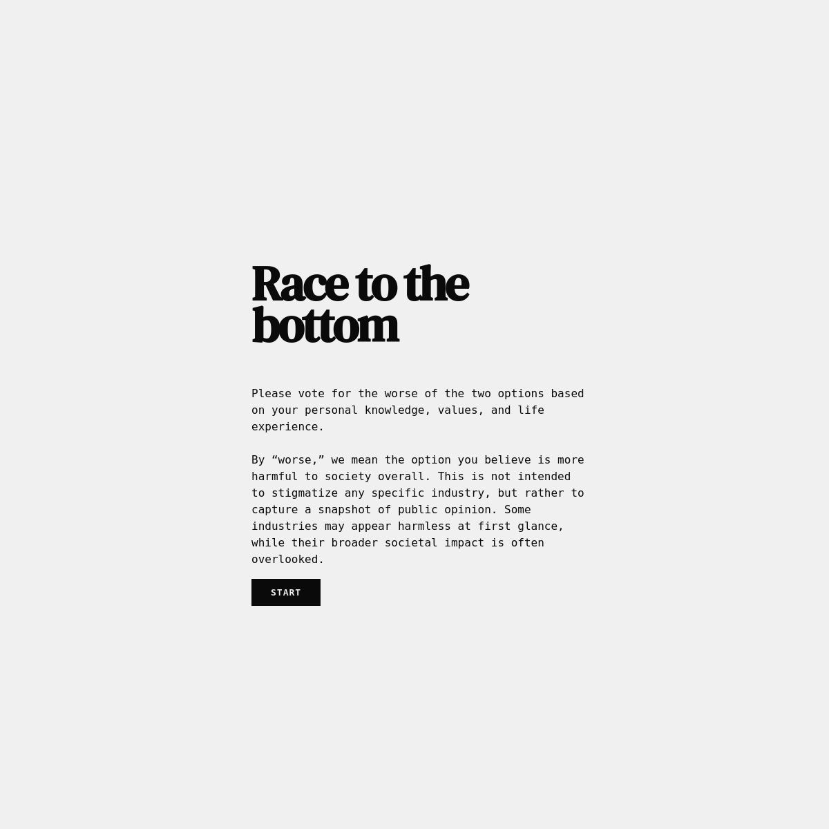
A stark social commentary piece presented as a minimal interface.
02
Color
#0A0A0AInk
#F0F0F0BG
rgba(10,10,10,1)Line
Strict achromatic palette using near-black on light gray for maximum legibility and starkness.
03
Typography
didone-serif · monospace
display70px · 700
body16px · 400
button10px · 700
04
Spacing
4px
8px
16px
24px
32px
48px
64px
96px
Consistent 16px vertical rhythm for body text blocks.
05
Surfaces
sm · 0px
md · 0px
lg · 0px
pill · 0px
None visible.
06
Layout
680container
1columns
16pxgutter
768breakpoints
Centered content column with generous top padding.
07
Motion & Interaction
220msmicro
400mssmall
800msmedium
cubic-bezier(0.4, 0.0, 0.2, 1)easing
Standard pointer cursor on interactive elements. · Trigger voting options.
08
Components
buttonSolid black rectangle with white uppercase text.
heroFull-screen centered typography block.
09
Voice & Don'ts
ToneObjective, serious, and analytical.
HeadlinesLarge, impactful serif typography.
CTAsSimple, imperative.
Don't use gradients — screenshot shows solid backgrounds.
Don't use rounded corners — screenshot shows sharp corners.
Don't use decorative illustrations — screenshot shows purely typographic elements.
Don't use multi-column layouts — screenshot shows a single centered column.
Don't use bright accent colors — screenshot shows only black and gray.
Don't use sans-serif for headlines — screenshot shows a bold didone serif.
Avoid: Playful language
Avoid: Decorative elements
Avoid: Ambiguity
11
System prompt
Positioned as a stark, serious editorial tool for evaluating societal impact. The palette is strictly achromatic: solid near-black text on a light gray background. Typography relies on a bold didone serif for headlines and a monospace font for body text, creating a focused, text-heavy experience. Key design constraints: absolutely no rounded corners or gradients are used, the layout is strictly single-column centered, and there are no decorative images or bright accent colors. The tone is objective and direct.
Bring this taste to your agent
Hand your AI agent a machine-readable spec of this design — tokens, type, motion, the whole DNA.