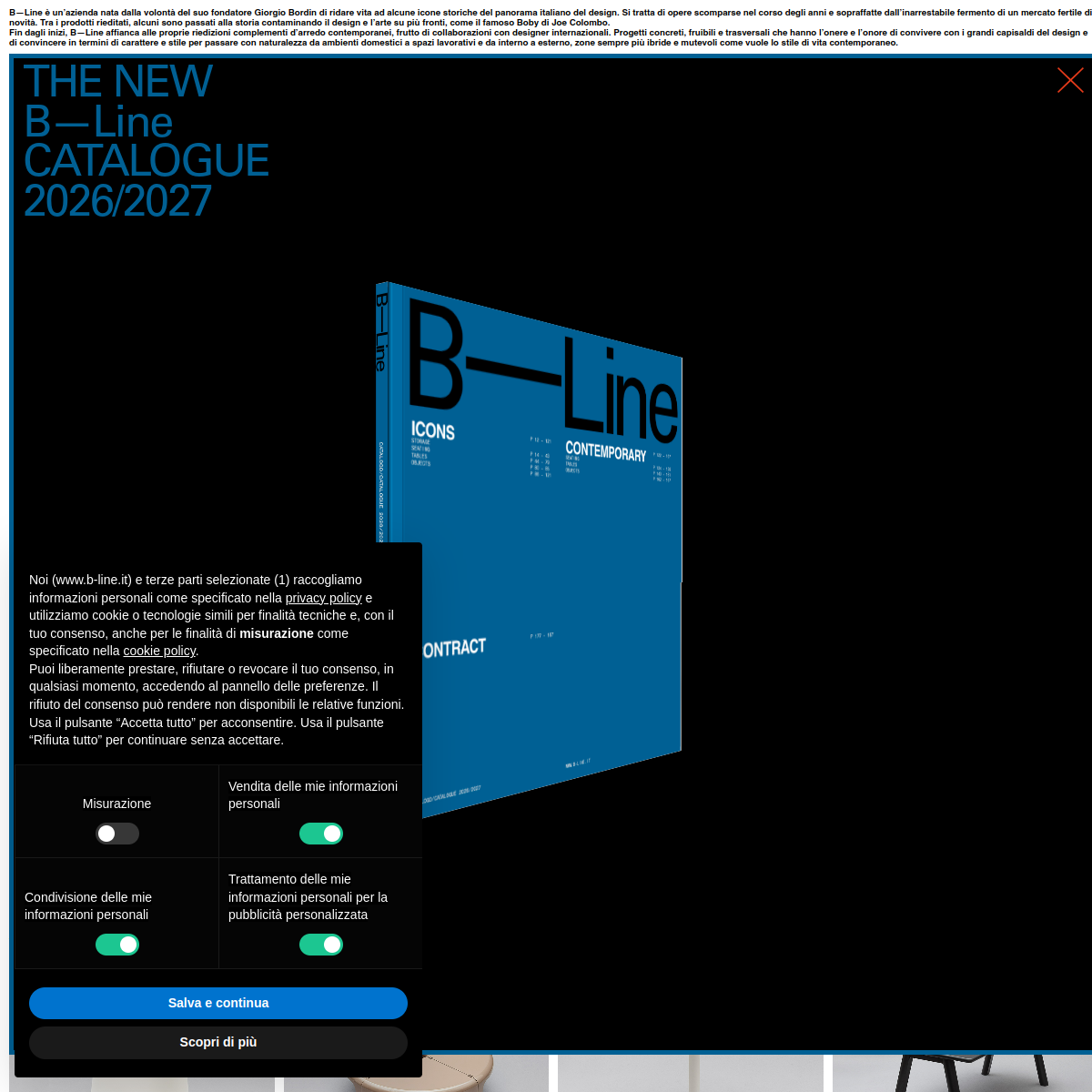
High-contrast, minimalist palette dominated by black and white, with a signature deep blue accent.
03
Typography
grotesque-sans · monospaced
display58px · 700
body14px · 400
caption12px · 400
Use uppercase for navigation links. · Keep negative letter-spacing for display headings. · Maintain clear hierarchy between bold headlines and light body text.
04
Spacing
4px
8px
16px
24px
32px
48px
64px
96px
Standard 4px base grid with generous whitespace around key elements.
Subtle color changes or scale transformations. · Immediate feedback through visual state change.
08
Components
buttonRounded, high-contrast buttons with clear text.
cardMinimalist product cards with strong typography.
chipSmall, rounded tags for categories.
inputSimple, bordered input fields.
heroLarge, full-width hero with bold typography and a 3D catalogue book.
09
Voice & Don'ts
ToneProfessional, authoritative, and minimalist.
HeadlinesBold, uppercase, and slightly condensed.
CTAsClear, action-oriented, and highly legible.
Don't use decorative scripts — screenshot shows strict grotesque-sans typography.
Don't use a multi-colored palette — screenshot shows a dominant black/white/blue scheme.
Don't use rounded cards with heavy shadows — screenshot shows flat surfaces with minimal shadow.
Don't use center-aligned body text — screenshot shows left-aligned text blocks.
Don't use small, cramped buttons — screenshot shows spacious, rounded buttons with clear padding.
Don't use complex, layered backgrounds — screenshot shows solid black or white backgrounds.
Avoid: Avoid using multiple font families.
Avoid: Avoid decorative or script fonts.
Avoid: Avoid overly busy layouts.
Avoid: Avoid low-contrast text.
Avoid: Avoid inconsistent button styles.
Avoid: Avoid excessive use of drop shadows.
11
System prompt
This site is a premium Italian furniture brand's digital catalogue, positioned as a high-end editorial showcase for iconic design pieces. The visual language is minimalist and authoritative, dominated by a stark black-and-white palette with a signature deep blue accent color. Typography relies on grotesque-sans categories, with bold, uppercase display fonts for headlines and clean sans-serif for body text. Critical design rules include: avoid using decorative or script fonts, maintain a strict black/white/blue color scheme, use left-aligned text blocks, and ensure all buttons are spacious and rounded. The layout emphasizes generous whitespace and high-contrast typography to create a sophisticated, gallery-like experience for showcasing furniture.
Bring this taste to your agent
Hand your AI agent a machine-readable spec of this design — tokens, type, motion, the whole DNA.